Award winners 2023
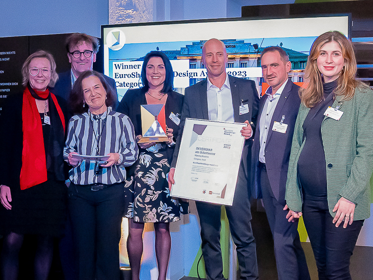
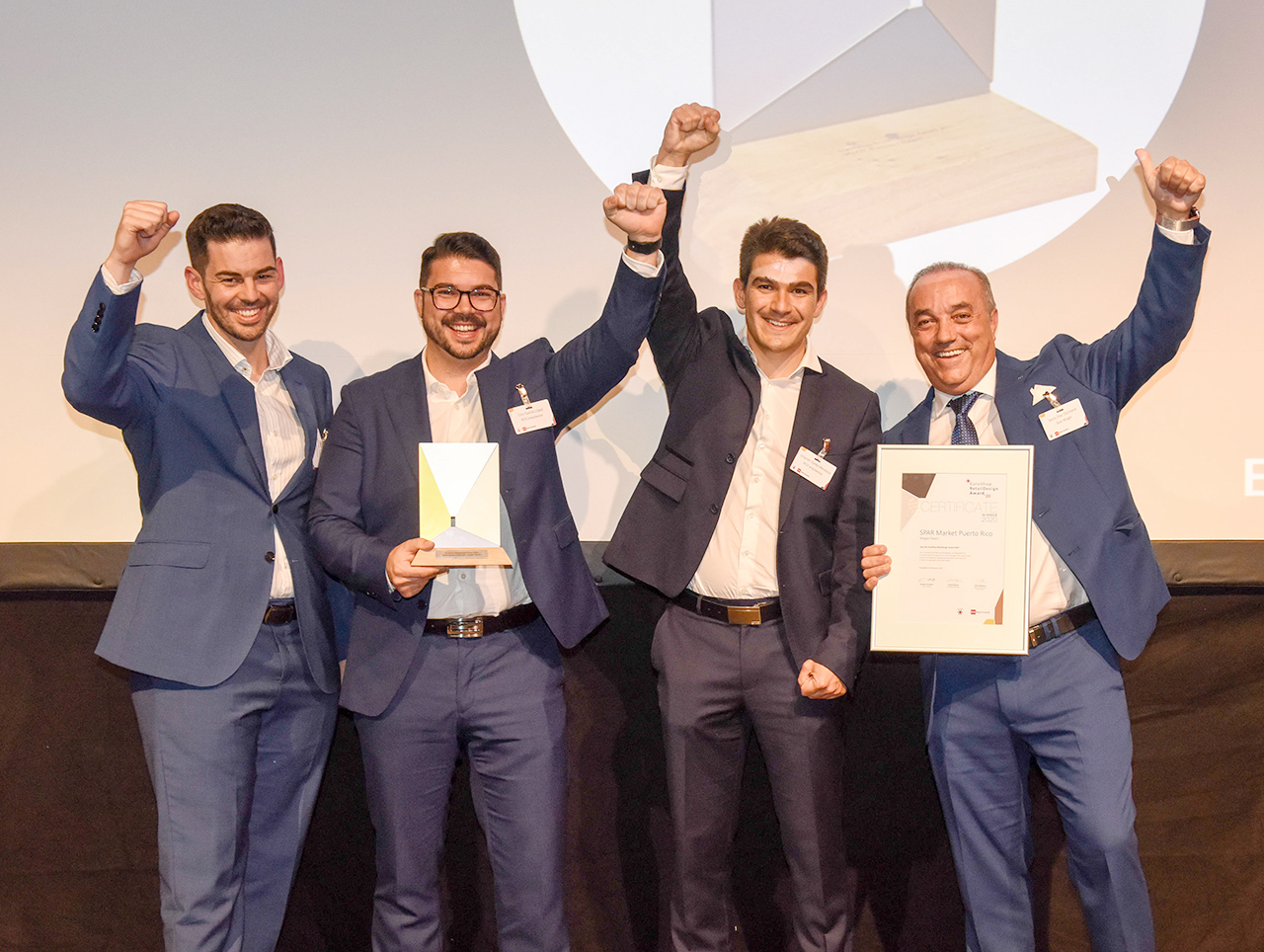
For the EuroShop RetailDesign Award 2023, 103 proposals from 31 countries were submitted, 42 nominees reached the final round. The winners 2023 are: Interspar am Schottentor in Vienna (Category Food), Tessuti Liverpool One in Liverpool (Category Fashion & Lifestyle), Coolblue in Dusseldorf (Category Digital), Casa Portuguesa do Pastel de Bacalhau in Vila Nova de Gaia (Category Hospitality), Adidas Terrex Flagship Store in Munich (Category Sustainability).
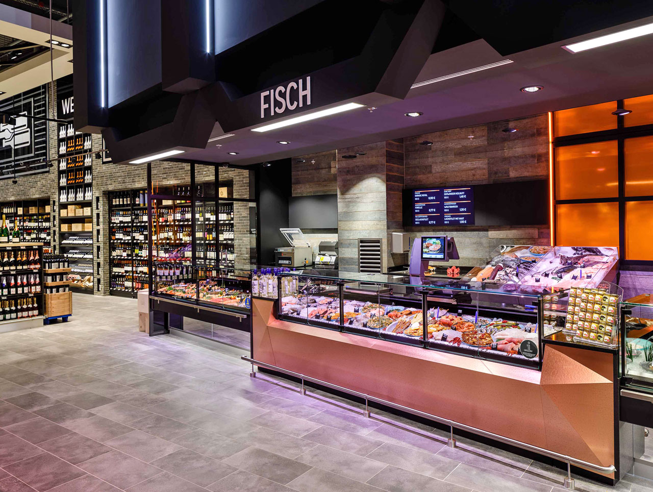
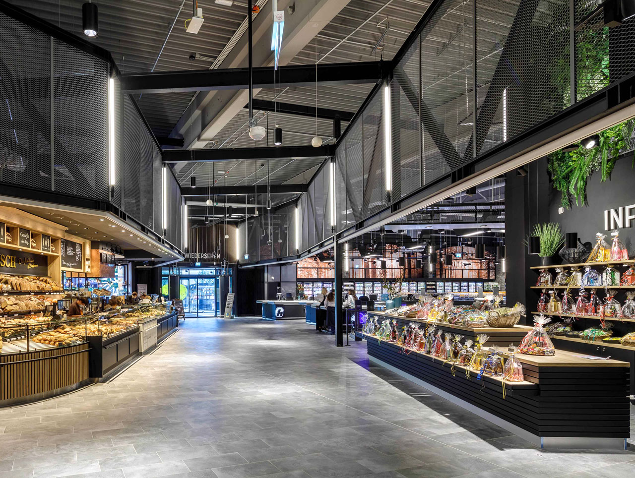
Category Food: Interspar am Schottentor
Vienna/Austria
Opened: May 2021
Retail space: 1.170 sqm
Retail Design: KBiA Kulmus Bügelmayer UMDASCH Store Makers
Read more
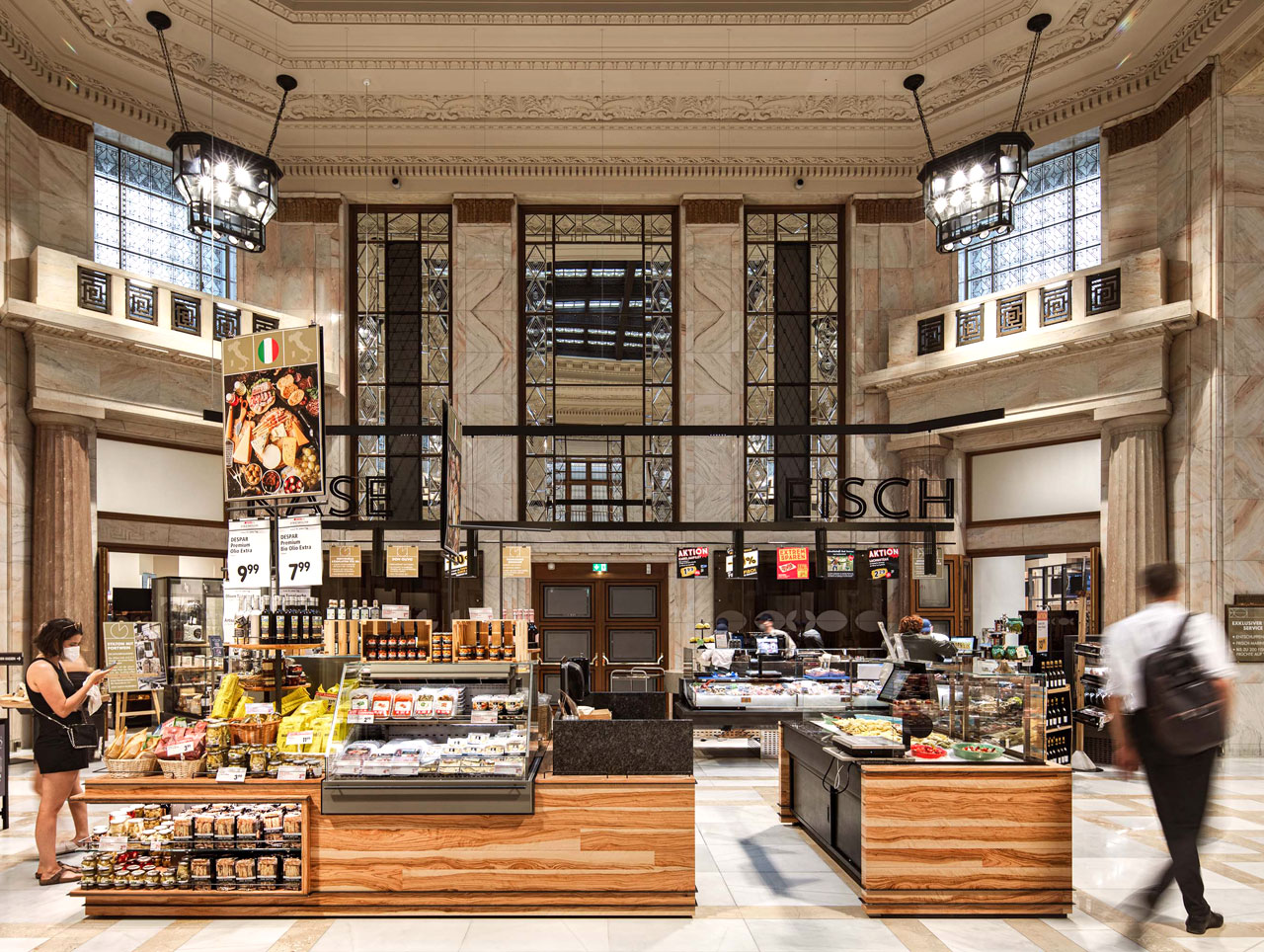
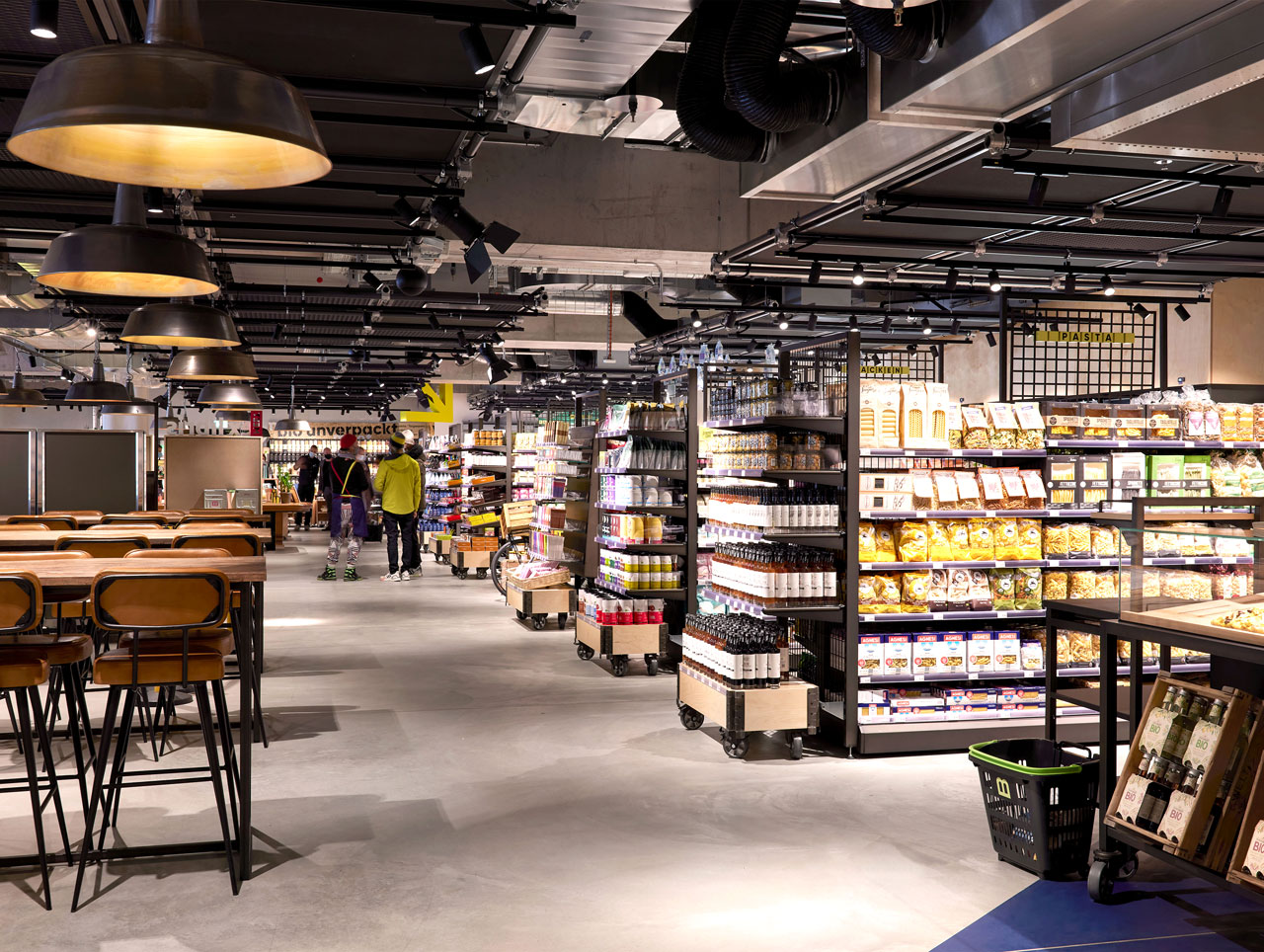
After more than three years of planning and renovation, Interspar has breathed new life into the former headquarters of the Wiener Bankverein “Haus am Schottentor” with this store, which opened in May 2021. The listed building from the Wilhelminian period is still considered a landmark for new bank buildings throughout Europe. Interspar’s goal was to preserve the historic substance of the building and adapt it to the requirements of the new use. For the necessary installations, materials from the time of construction were combined with modern technology and a visually identical second floor was installed over the existing marble. The branch focuses on snacks and hot meals, which make up around a third of the range. It is intended to attract mainly urban and student customers as well as employees from the surrounding offices. Covering approximately 1.170 sqm, the store offers panini, regional dry-aged beef and regional fish, among other things. Another new feature is the “Mezzanin” restaurant concept, the supermarket chain’s first à la carte restaurant.
Category Fashion & Lifestyle: Tessuti Liverpool One, Liverpool/UK
Opened: August 2022
Retail space: 2.040 sqm
Retail Design: Counterfeit Studio
Read more
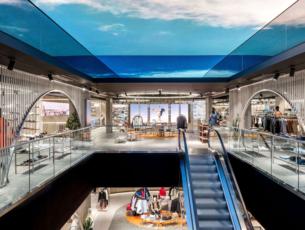
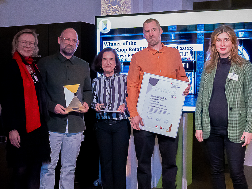
The fashion retailer Tessuti was founded in 1985 and has since become a shopping destination for a curated number of designer collections. The new flagship store opened last August and covers an area of around 2.040 sqm over three floors. For the store design, the architects relied on a combination of historic Liverpool engineering, classic Italian style and modern digital elements. In the store, a large “lozenge” serves as a striking focal point for the store intended to draw the consumer’s gaze up to the highlight, the XL format digital screen. Materials such as terrazzo, brass and marble are used on all floors of the store and are meant to be a nod to the company’s Italian roots. Orange neon lights and fabrics, brushed stainless steel surfaces and red tiles set accents and underline the modern character of the store. The changing rooms with special VIP rooms are aimed at a discerning clientele and round off the exclusive shopping experience.
Category Digital: Coolblue
Dusseldorf, Germany
Opened: November 2021
Retail space: 1.316 sqm
Retail Design: Desarc
Read more
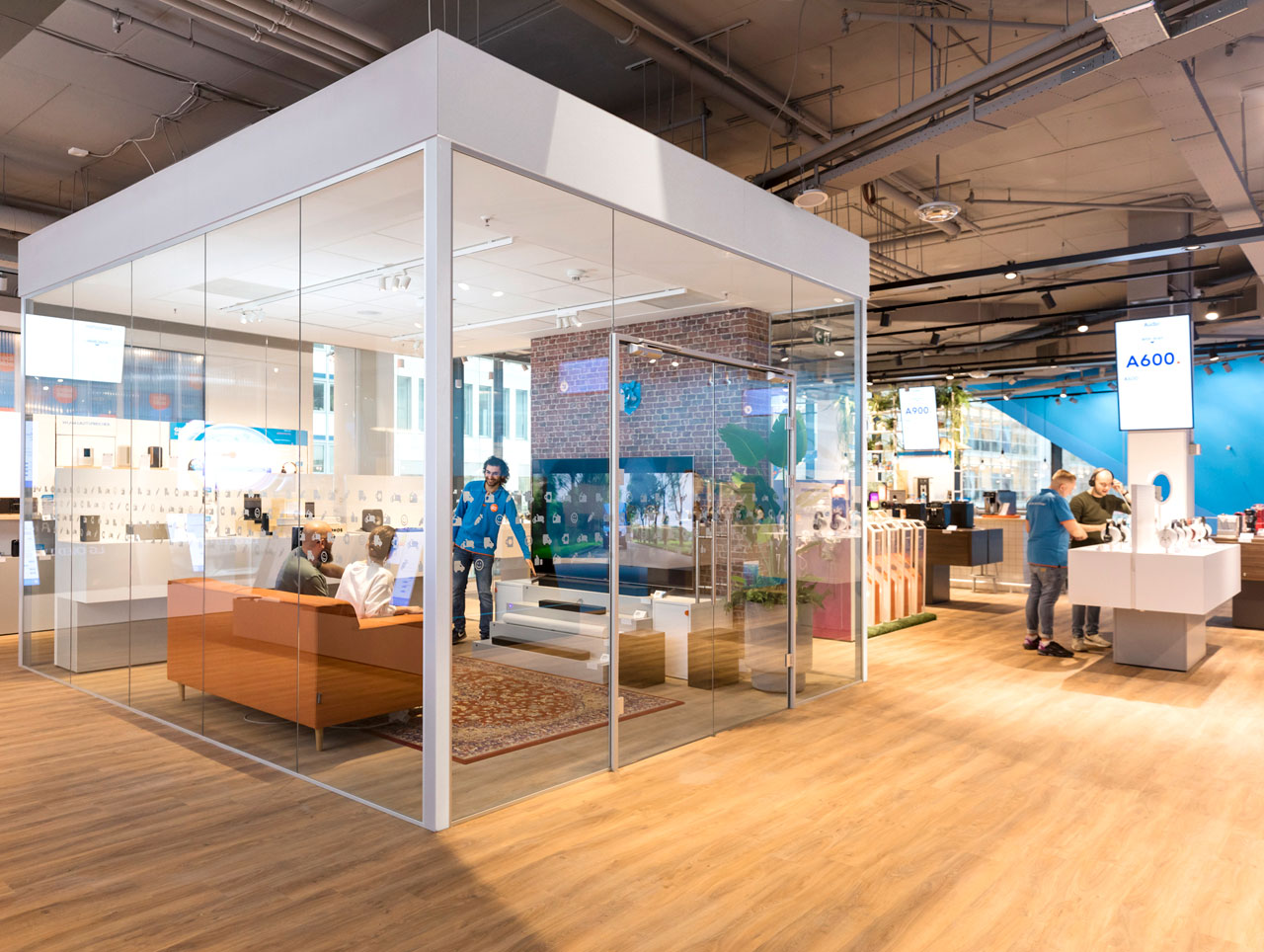
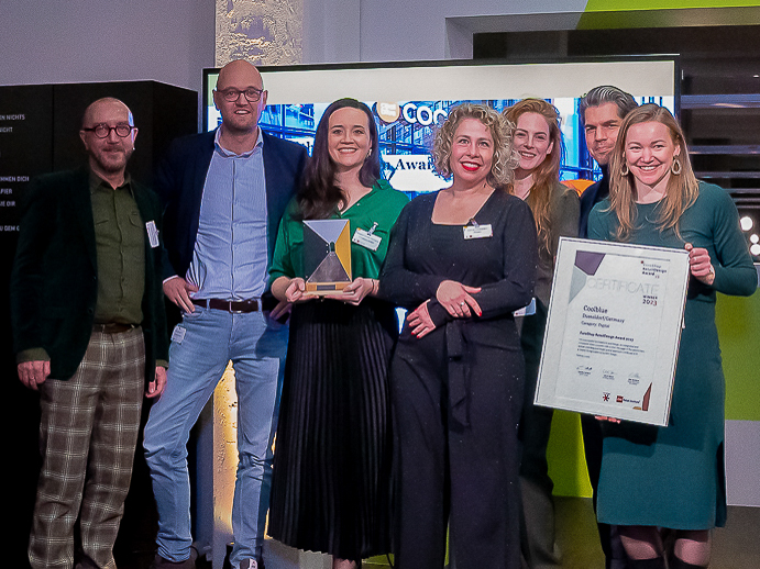
In Dusseldorf, the Dutch online electronics retailer Coolblue opened its first German branch in November 2021. The Rotterdam-based retail chain also wants to pursue its omnichannel strategy in this country combining both online and in-store sales channels. Customers can test sample products on site, compare them with other items from the same category in the online store and order them. The products are explained in more detail both in-store and in the Coolblue app and further advisory services are on offer, including augmented reality functionalities. Customers can, for example, virtually place TV screens in their homes to find out which size suits them best. If you scan the items on display with your smartphone using a QR code, the app will display the relevant customer reviews in the app. Click & Reserve, Click & Collect and the option of mobile payment by mobile phone or smartwatch round off the in-store digital offering.
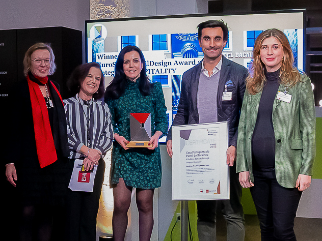
Category Hospitality: Casa Portuguesa do Pastel de Bacalhau
Vila Nova de Gaia, Portugal
Opened: April 2021
Retail space: 235 sqm
Retail Design: Grupo O Valor do Tempo
Read more
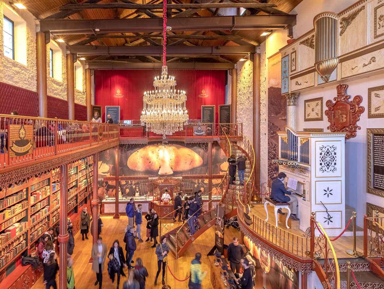
The historic warehouse in Vila Nova de Gaia, which used to house a port wine cellar, was renovated in spring 2021 to pay homage to Portugal’s history, the cheese production in the nearby Serra da Estrela mountain range and the wine producers of Porto. The nineteenth century pipe organ blends harmoniously with the historical ambience and serves as an eye-catching feature for guests enjoying a local delicacy: a codfish cake with Serra cheese filling, together with a nice glass of Port wine. The concept of the store aims to showcase the country’s highlights: gastronomy and culture. Hourly live organ concerts by changing artists provide a musical backdrop to the shopping experience. The colour red dominates the store design, echoing the Portuguese flag, while golden tones evoke Portugal’s golden age. A 320 kg ceiling chandelier complements the magnificent ambience.
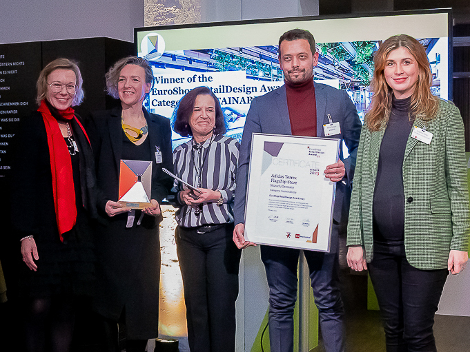
Category Sustainability: Adidas Terrex Flagship Store, Munich, Germany
Opened: November 2021
Retail space: 378 sqm
Retail Design: adidas design team and Checkland & Kindleysides with Stadler Interior services
Read more
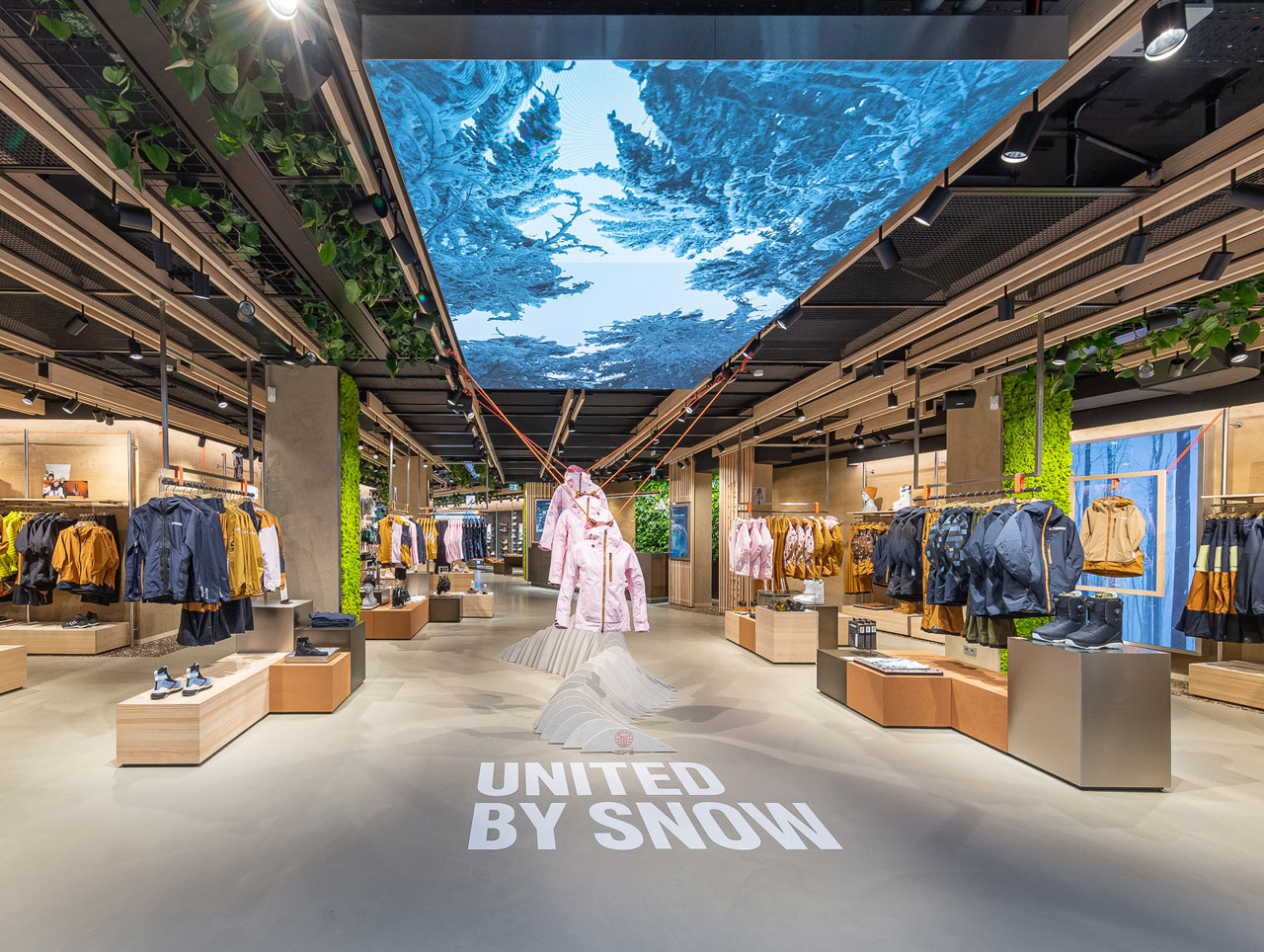
Adidas Terrex, the outdoor division of Adidas, opened its first flagship store in Europe in November 2021. Located at the foot of the Alps, the 378 sqm retail space puts emphasis on sustainability and regional character as a contact point for the local outdoor community. The interior of the shop was made from natural, resource-saving and recyclable materials, reflecting Adidas’ overarching goal of ending plastic waste. Among other things, Adidas has pledged to only use 100 percent recycled plastic in its collections by 2024. The customer experience will be enhanced through on-site services and digital in-store tools. Adidas Terrex makes a point of involving local communities such as the “Adidas Runners” and promoting regular exchange. The aim is to make outdoor sports accessible to all those interested, breaking down barriers and connecting like-minded people. This involves holding regular events, including workshops and lectures with athletes.
Award winners 2022
For the EuroShop RetailDesign Award 2022, 87 proposals from 28 countries were submitted, 37 nominees reached the final round. The winners 2022 are: Apple Marina Bay Sands in Singapore (Category Fashion & Lifestyle), BRIDGE in Zurich (Category Hospitality), EDEKA Hundrieser in Essen (Category Food), FC Bayern World in Munich (Category Digital), GREEN B in Florence (Category Sustainability).
Category Food: EDEKA Hundrieser
Essen / Germany
Opened: July 2020
Retail space: 2.500 sqm
Retail Design: Kinzel Architecture
Read more
Essen as a formerly mining region is a city with defining history. The location of the market in Schönebeck was a colliery location until the 20th century. The design lets the times of the industry come back to life by reinterpreted and modern elements and subtly indicates the cultural roots of the city Essen.The idea was to use the design to turn a special location-related object into a new impetus for supermarket culture,which allows you to immerse yourself in the unmistakable history of this place. The back then used purely functional materials and construction methods of the colliery grounds create the characteristic and industrial charm through their historical and local character to this day.
Material combinations like brick look, matt black refined metal profiles, exposed supporting structure, exposed concrete and copper as well as clamped grids as room-dividing elements form a solid basis for the industrial character of the new EDEKA store. There are also design components such as the arched, slim metal profiles, which elegantly hint at the typical window constructions of old industrial halls. In the background of this construction, color-coordinated atmospheric photo prints of light-flooded forests are inserted on the outer walls which skillfully stage the goods.
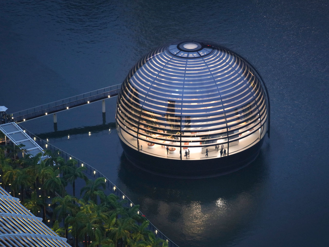
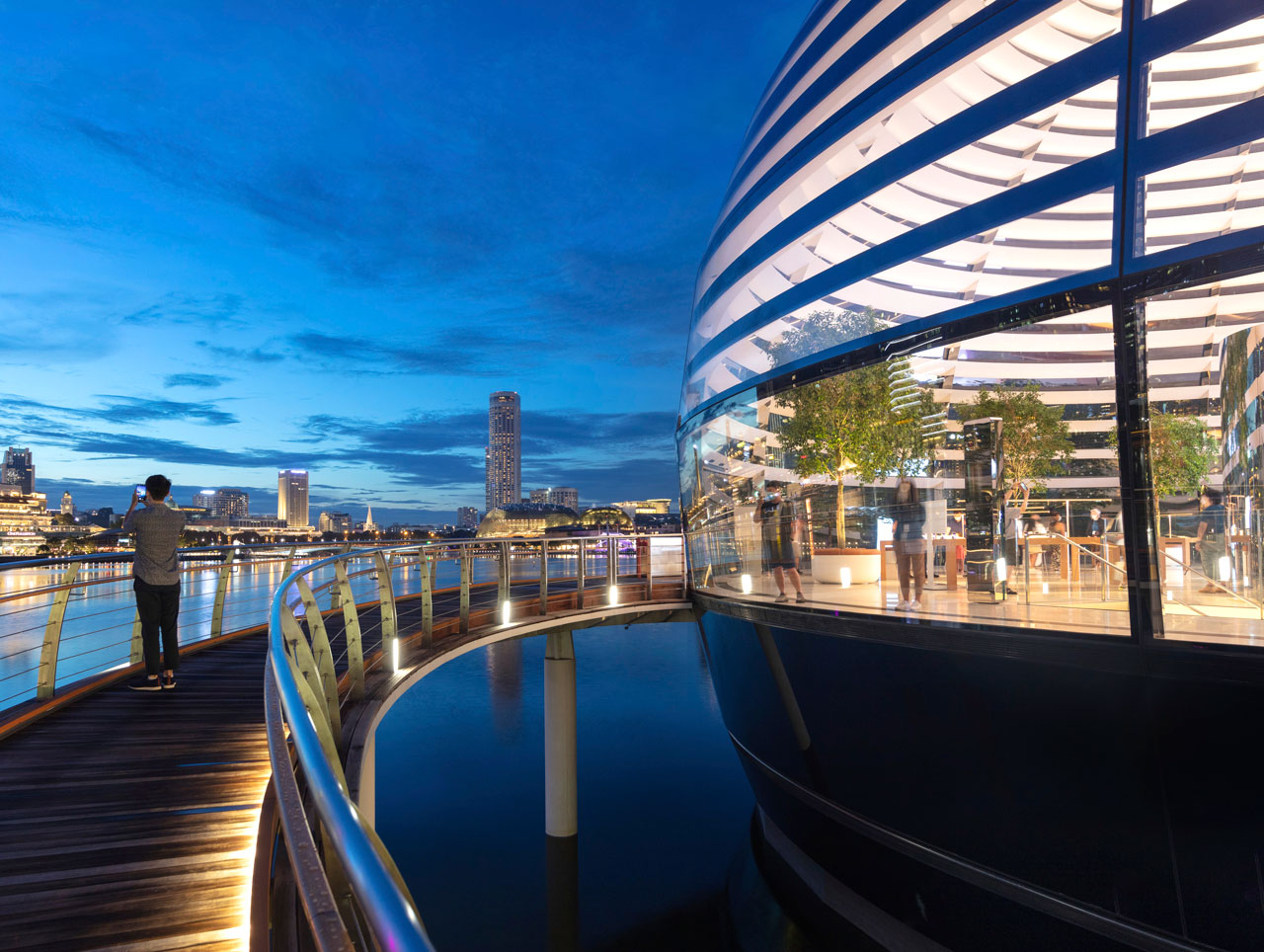
Category Fashion & Lifestyle: Apple Singapore
Opened: September 2020
Retail space: 669 sqm
Retail Design: Foster + Partners
Read more
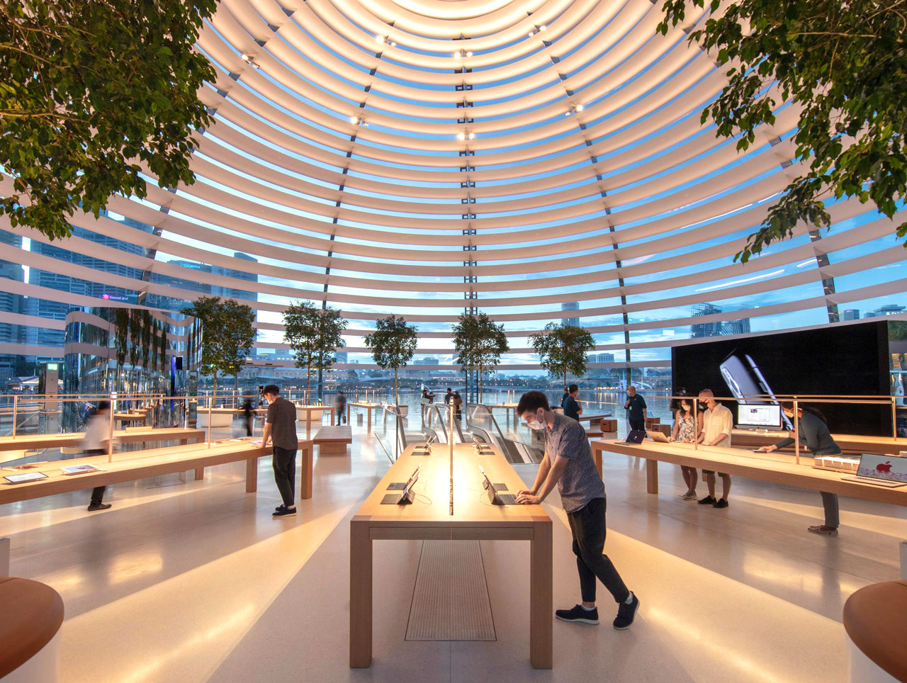
Apple Marina Bay Sands is all about the delicate interplay between transparency and shade. The structure dissolves the boundary between the inside and outside, creating a minimal platform that floats gently in the water, looking out over the bay and the spectacular Singapore skyline. Structurally, the dome acts as a hybrid steel and glass shell, where the grid of steel sections support the weight of the glass and shading, and the curved structural glass panels restrain the steel elements laterally and stiffen the overall form against lateral loads. Integrated solar shading devices keep the interior cool. Each of the 114 panels of glass is carefully selected to meet glazing indices. At the top a semi-opaque oculus provides a dramatic shaft of light that travels through the space, reminiscent of the famous Pantheon in Rome.
The store can be entered through The Shoppes at Marina Bay Sands via a beautifully curved stone entrance, flanked by Apple’s signature Avenue display on either side of a 45-metre long and 7.6-metre wide space. This leads directly to a set of dramatic escalators that take visitors on a “kaleidoscopic” journey to the heart of the spectacular domed space.
Category Digital: FC Bayern World
Munich / Germany
Opened: December 2020
Retail space: 1.000 sqm
Retail Design: umdasch The Store Makers
Read more
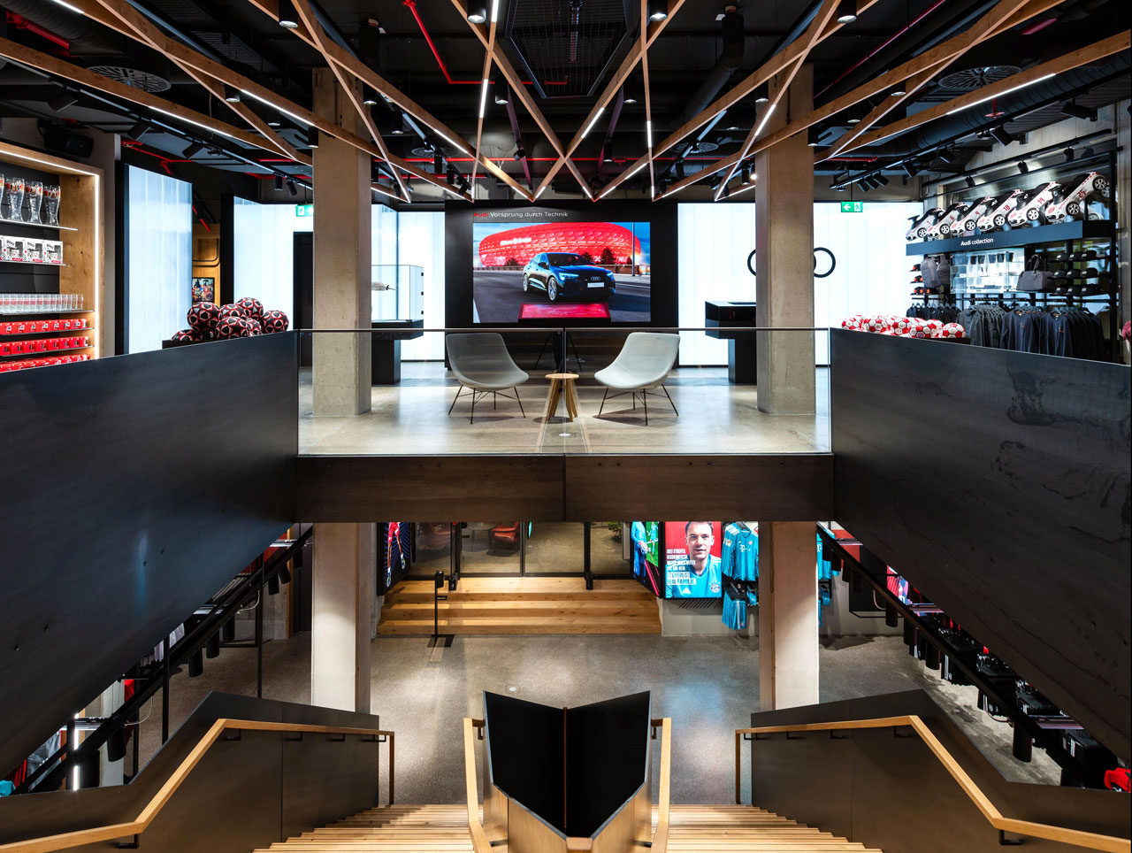
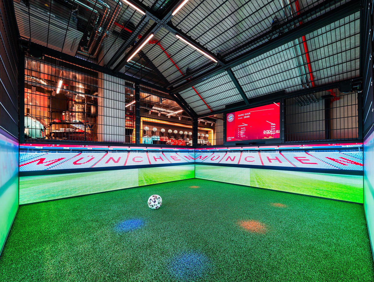
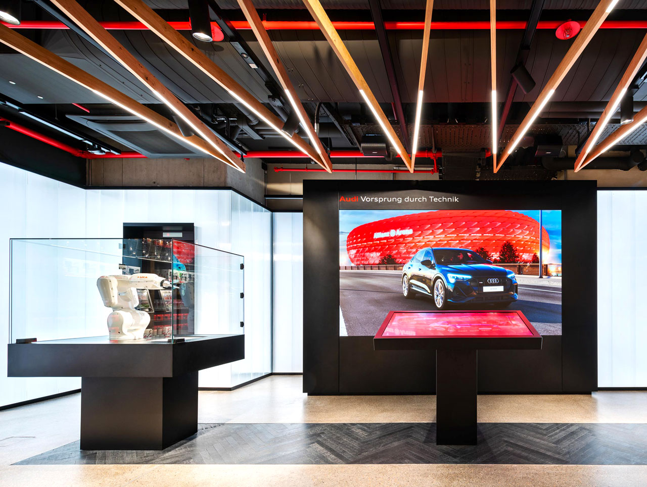
The new FC Bayern World opened for all its fans on 10.12.2020 in the heart of the Bavarian capital Munich (DE). When you enter the flagship store, it becomes clear immediately for whom it was created: a laser has burned the message “FOR THE BEST FANS IN THE WORLD” into the mat on the floor. Creating a store for “the best fans” in the world was the main objective for the concept creation. The entire store can be accessed across all three floors via a central staircase. The eye-catching diamond shape in the stairwell – derived from the Bavarian coat of arms in the logo – links all the floors optically. The emotional heart is the oversized LED wall on the underside of the staircase.
The ground floor is dedicated to the team of the championship record-holders: the players were scanned and life-size figures were created for the store using a 3-D printer. The more than 20 integrated digital touchpoints in the store form a part of the integral store concept and include numerous innovations, including mirror screens in the changing cabins, several selfie points and transparent screens for trophy presentation and projection mapping in the checkout zone.
Category Hospitality: BRIDGE
Zurich / Switzerland
Opened: April 2021
Retail space: 2.000 sqm
Retail Design: Interstore | Schweitzer
Read more
With BRIDGE, Genossenschaft Migros Zürich opened a market for the first time, with the objective to re-establish & celebrate the sensorial aspect of food, bringing people into a shared experience of taste and discovery. Opened in April 2021, and covering 2000 m², Bridge is located near a busy transitory hub in downtown Zurich. Distributed on two levels, the space has been conceived as the connector between a diverse fresh food market, creative local partner catering and store events. By translating the motto “meet food, meet market, meet people” into reality, the market has become the new meeting place for food lovers in the heart of Zurich.
With this local context in mind, Bridge has been designed with an urban industrial look, using dark exposed ceilings and black/stainless steel finishes to the displays and equipment. To give the market a distinct feel, bold brightly coloured communications adorn the open space & food vendor stations, while the aubergine-coloured cement floor provides a warm and uplifting atmosphere. Architecturally, an eye-catching bridge connects the main levels at the centre. This connection forms a key circulatory element, where the customer can experience the spectacle of the food market from different angles, encouraging and motivating a journey of discovery around the different spaces.
Category Sustainability: GREEN B
Florence / Italy
Opened: March 2021
Retail space: 160 sqm
Retail Design: Benetton Group
Read more
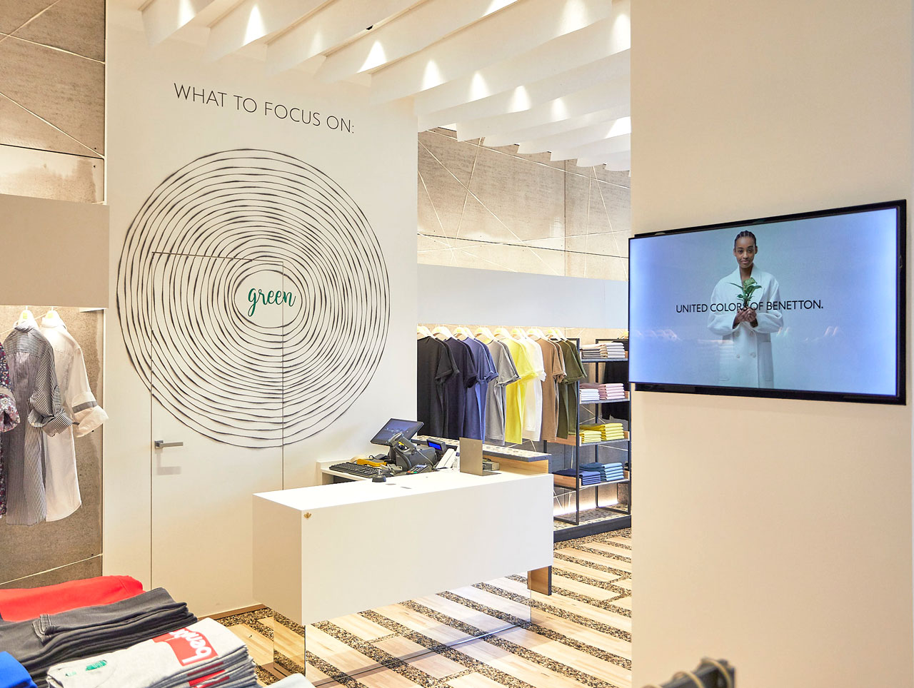
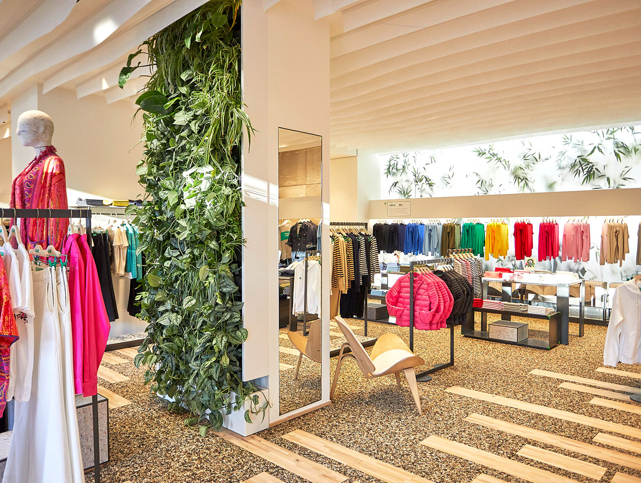
GREEN B by Benetton, presents a new store theme characterized by the use of sustainable materials, realized out of an abundant use of recycled and natural materials and cutting-edge technologies for energy savings that constantly measure air quality and purify the environment.
The walls are treated with a mineral paint, which have antibacterical and anti-mold properties that can reduce airborne pollutants within the environment. On top of that, a special perfume is diffused into the interior environment, made of pure essences and free of toxic substances or allergens that has been integrated with a special molecule contribuings to the air sanitization. Furniture tops a display stand bases are made of a compound created form old buttons, that are usually difficult to dispose of, are mixed in a solvent free hydro resin. Recycled wool in its raw state is reused in the design of the perimeter lining and as decoration for the curtains in the dressing rooms. Shelves, display bases and mannequins are made in “rossino”, which is a material created from recycled textile fibers. The ceiling is characterized by the use of recycled polyester sails, creating a light cloud that designs the space in a way as if it were an outdoor space.
Award winners 2020
The EuroShop RetailDesign Award ceremony took place in Düsseldorf, during the EuroShop 2020 – The world´s No. 1 Retail Trade Fair.
There were 73 entries from 22 countries, and the winning projects came from Lausanne, Leavesden and Mogán.
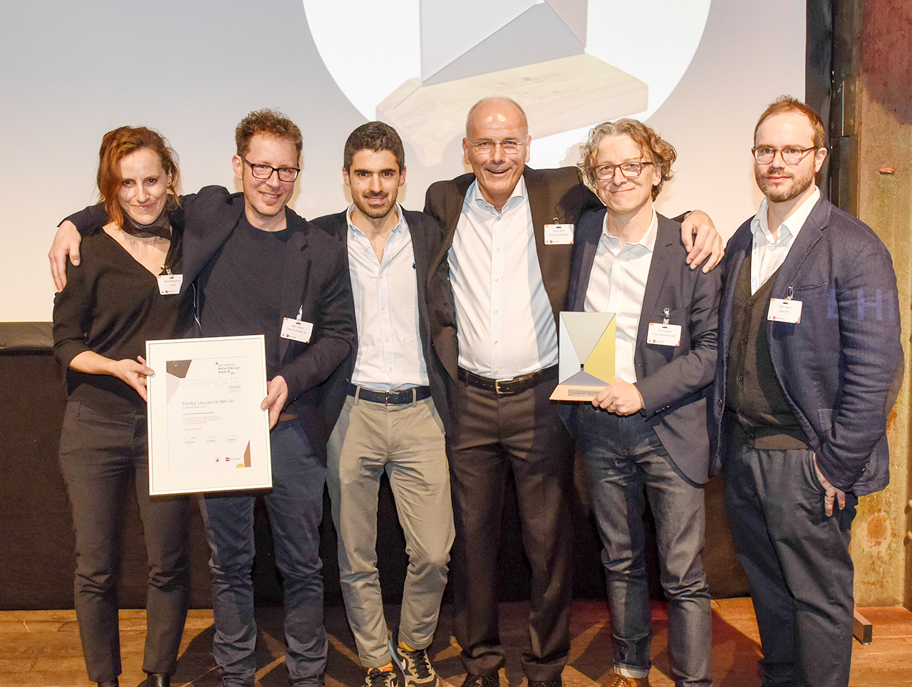
Fooby Lausanne Bel-Air
Lausanne/Switzerland
Opened: March 2019
Retail space: 1000 sqm
Retail Design: Brem+Zehnder AG
Read more
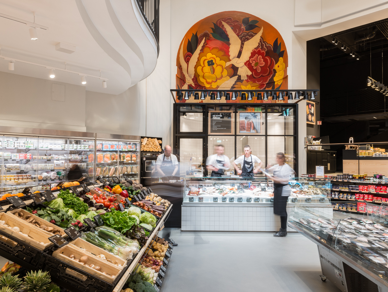
Coop Switzerland’s first Fooby store opened in a 1,000-sqm retail space in Lausanne’s former Kursaal-Théâtre, and it is the brick-and-mortar extension of the online platform. Fooby intends this store to be a bridge connecting the digital culinary world with the analogue one as well as a meeting place for Coop’s successful foodie community.
Across three floors, the culinary arts can be experienced via touch, smell and taste. In addition to locally manufactured products, the retail space provides a stage for around 20 regional producers. For example, specialties from Romandy enrich the range of products. The range is also supplemented by non-food items like kitchenware and decor. In addition to the culinary arts and regional products, the concept focuses on sustainability. According to the store’s own figures, 70 percent of its products are produced sustainably.
Renovations and remodelling for the Fooby store began in late 2016. Up until then, the former theatre had been used as a cinema, among other things. The erstwhile theatre atmosphere was brought back to life: frescos in the main theatre were restored, and the stage was transformed to include a curing chamber for cheese and delicatessen items as well as a sales point. The building’s distinctive symmetry corresponds to the austere, reserved materials used inside the store. The materials concept supports the Fooby brand in both form and colour and harmonises with the historical architecture. Black, white and real wood form the foundation and set the stage for the products.
SPAR MARKET PUERTO RICO
Mogán, Gran Canaria/Spain
Opened: January 2019
Retail space: 2207 sqm
Retail Design: RCO ARQUITECTOS
Read more
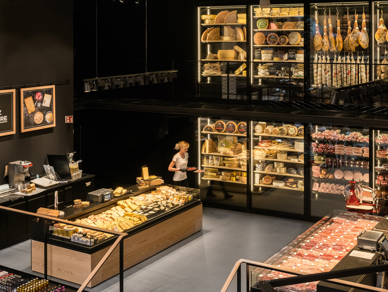
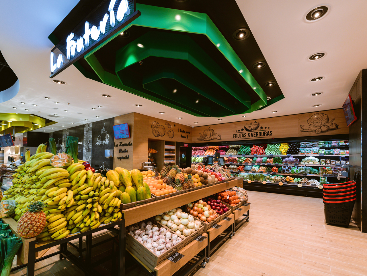
Spar Gran Canaria is expanding its store network on the Canary Islands. The new Spar Market Puerto Rico in Mogán covers more than 2,000 sqm and focuses on fresh food and products from local farms.
The goal of the new concept was to transfer the ambience of traditional markets to a modern retail store. A variety of islands capture the character of a farmers’ market. The colour palette as well as various design elements, such as dark display units combined with warm materials like wood, create a modern look and highlight individual departments.
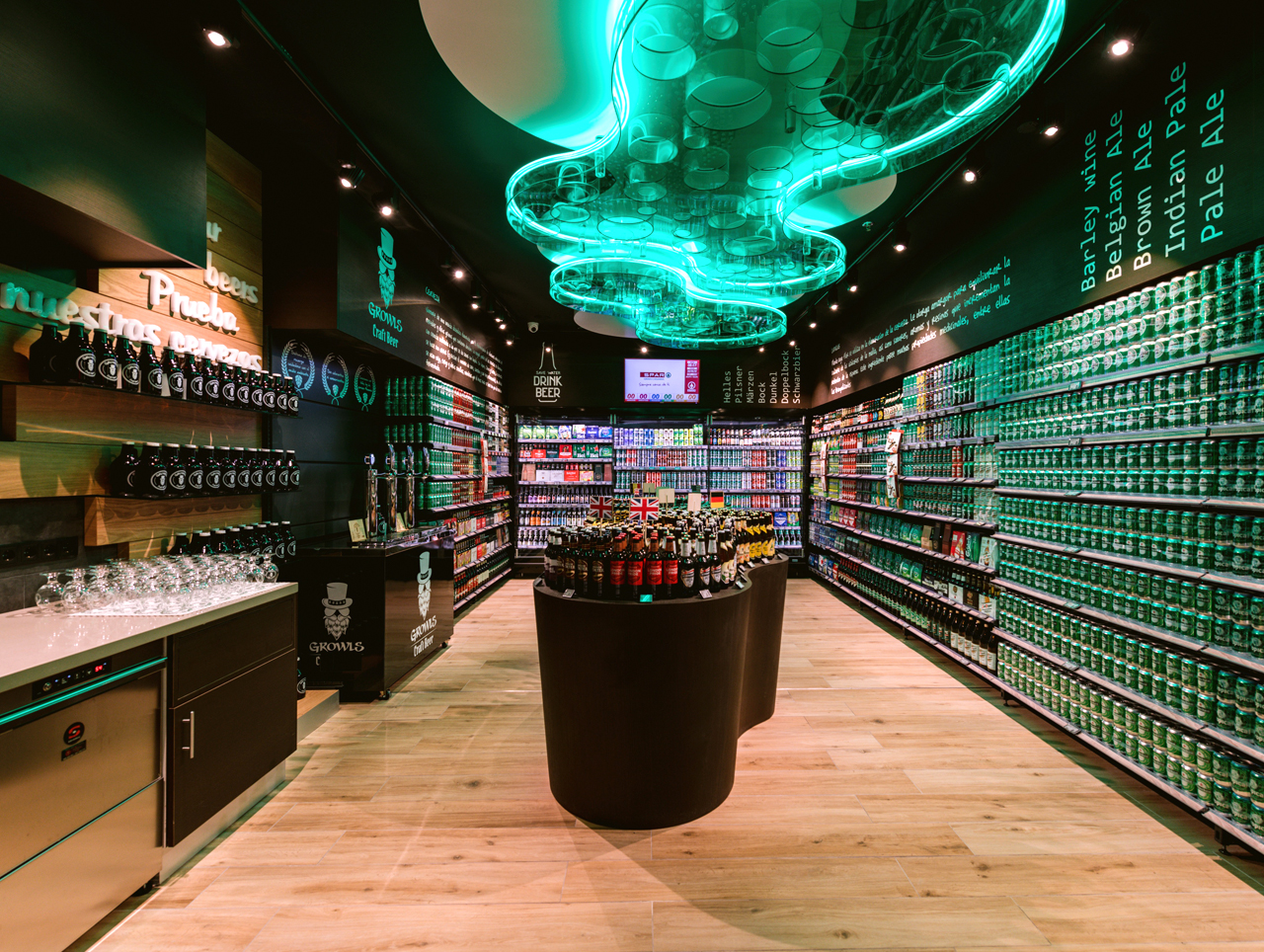
At the heart of the supermarket are refrigerated walk-in rooms for beer, wine and cheese. Special exhibits in these spaces present products and offer samples for tasting. Graphically understated, illuminated lettering above the individual rooms announces which products can be found in each of the small rooms.
Suspended ceilings, a green light installation on the beer room’s ceiling as well as illustrations on the walls and glass doors provide an interesting decorative backdrop for the products.
The Making Of Harry Potter
Leavesden/UK
Opened: April 2019
Retail space: 836 sqm
Retail Design: Lumsden Design
Read more
In Leavesden, to the north of London, fans of witchcraft and wizardry can walk in Harry Potter’s footsteps. Platform 9 ¾ and the Hogwarts Express, the Forbidden Forest and Diagon Alley – visitors can take a tour and peek behind the studio curtains to see where many of the fantastic beasts and effects featured in the Harry Potter films were created.
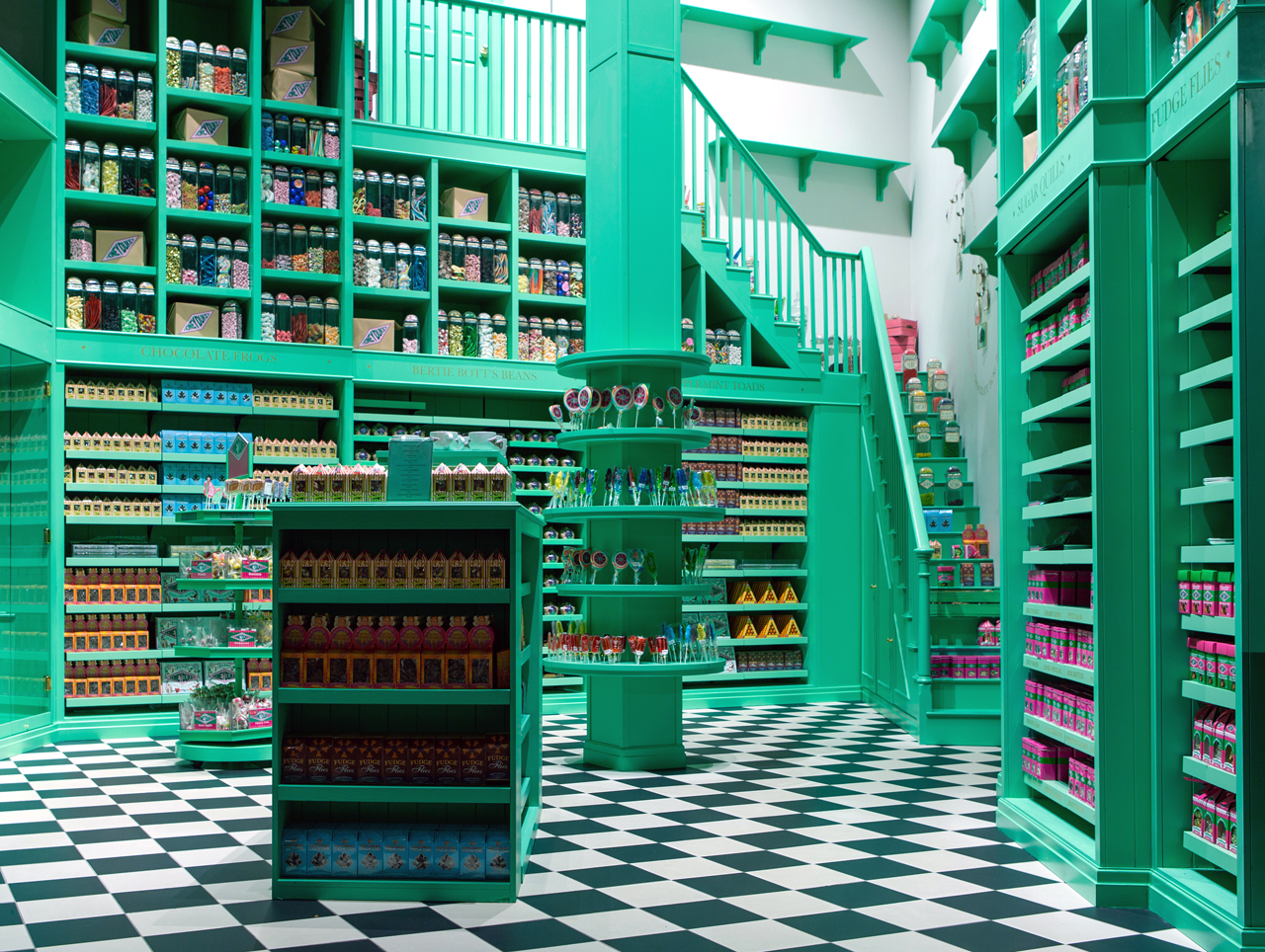
The “Gothic” look typical of the Harry Potter films is reflected in the store design as well. The atmosphere in the Dark Arts, where you can buy a shrunken head or a Horcrux, is sinister, while the sweets shop Honeydukes is bright and colourful; the division of the store into thematic zones allows visitors to orientate themselves intuitively. Special effects, including “real” goblins that count gold coins, make the magic moments unforgettable.
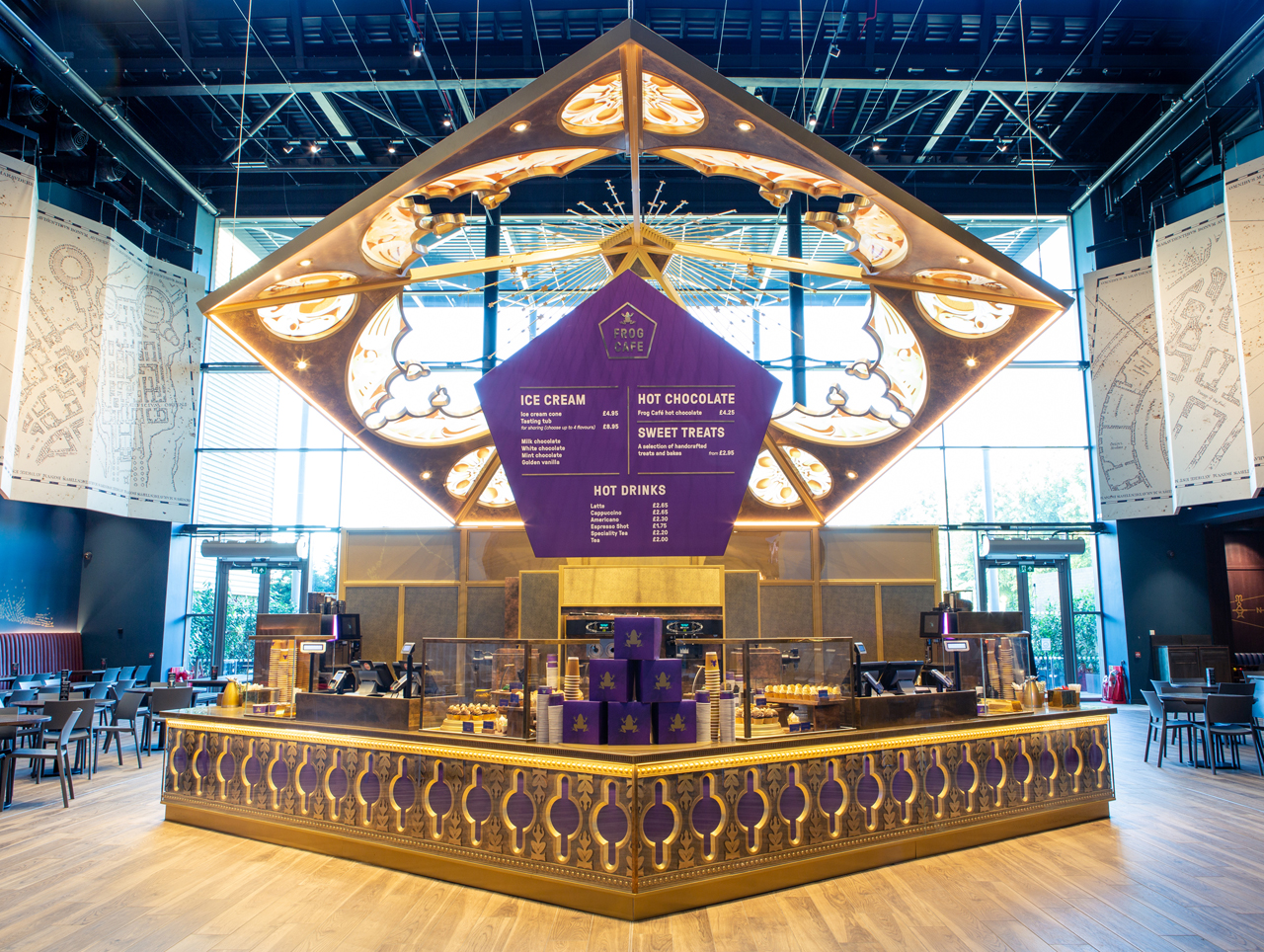
The studio’s new culinary offerings include restaurants that are fully part of the Harry Potter experience, such as the Chocolate Frog Café, where you can buy the frog-shaped chocolates that appear in the film series, and the adjacent Food Hall, in which floating candles are part of an illuminated night sky. Original props from the Harry Potter films bring the entire studio to life. An engraving service for limited edition products and wizard’s robes that can be embroidered with a customer’s name free of charge round out the magical concept.

